
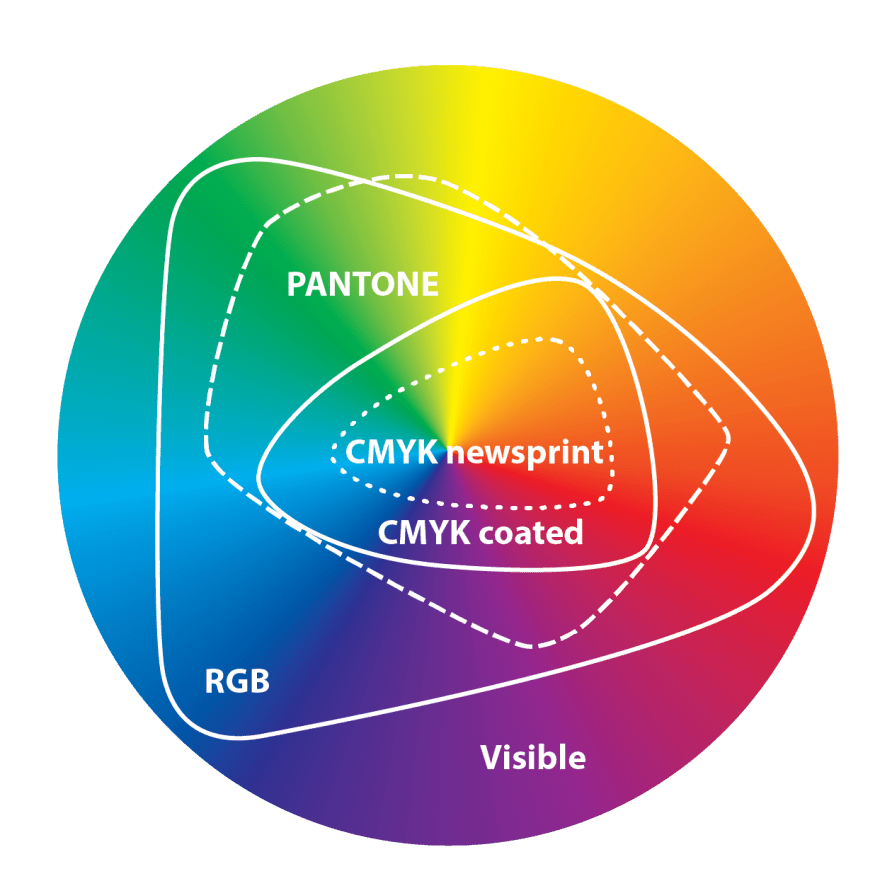
 , CMYK coated, and newsprint gamuts. Image credit: Wade Dansby
It’s important to remember that in the entire visible color spectrum we can only reproduce a limited amount. Whether it is on screen with pixels or in print with inks/toner there is only a certain range of colors that can reliably be shown or printed.
RGB (or what you see on your TV, monitor, or mobile device screen) has a pretty wide gamut (color space) but it is still far short of every color you can possibly see. As technology improves, the RGB gamut is increasing (e.g. Colormatch RGB, Adobe RGB 1998, and ProPhoto RGB). However, what you see on a computer screen may be irreproducible on press. Be sure when working on projects for print to use a color profile in applications like InDesign or Photoshop (e.g. U.S. Web Coated (SWOP) v2, U.S. Sheetfed Uncoated v2, and US Newsprint (SNAP 2007)) to ensure what you see on screen is limited to what can be printed on paper or other printed substrates.
RGB is written using 0–255 for Red, Blue, and Green pixels shown on the screen. (e.g. black=R0 G0 B0, white=R255 G255 B255, Green=R0 G255 B0, Yellow=R255 G255 B0), and so on).
Alternatively, Hexadecimal (aka Web safe RGB, base 16, or Hex) This color system is used by HTML, JavaScript, and other digital languages to represent RGB colors in code. This base 16 numeral system is written using 0–9 and A–F (or a–f), to represent values ten to fifteen. (e.g. black=#000000, white=#FFFFFF, Green=#00FF00, Yellow=#FFFF00, and so on).
CMYK is a limited color set used by printing presses, toner copiers, or your home inkjet Very small dots of Cyan, Magenta, Yellow, and Key (Black) inks are combined to form many different colors. Impurities in these inks prevent achieving as many colors as you might like on a printed surface. The color gamut can vary widely based on what substrate you are printing on (e.g. Coated paper, Uncoated paper, Tee Shirts, Newsprint, Vinyl, etc.). Some of these limitations have been ameliorated by press techniques using hexachrome, PANTONE inks, or other SPOT inks. If you have high-end ink jet you may notice it has 6, 8, or even 12 colors to achieve an even wider color gamut. Even these can only approach a portion of what is possible to reproduce in the RGB space.
CMYK is written using 0–100% for amounts of Cyan, Magenta, Yellow, and Key (Black) inks or toner combined to form a color. (e.g. white=C0 M0 Y0 K0, Green=C100 M0 Y100 K0, Yellow=C0 M0 Y100 K0, and so on). In CMYK printing black can be just 100% of black ink or a darker form of rich black (e.g. rich black=C50 M40 Y35 K100.) Don’t ever use C100 M100 Y100 K100 as presses can only accommodate a certain percentage of ink coverage. This is usually no more than a total ink coverage of 260-320%, depending on your press and the paper being printed on. (e.g. C50 M40 Y35 K100 would = 225% total ink coverage.) Before printing, check with your press to see their press specs. They may even have custom color profiles that can be used in Adobe creative applications.
SPOT colors. These are the individual pigments (similar to acrylic paints) that are used on an offset press or silkscreen to achieve a pure single (or two or three or more) color(s). The PANTONE system of inks is one way of creating SPOT colors (see below). There are other systems as well (e.g. TOYO, RAL, etc). Often when making stationery (letterhead, business cards, etc) SPOT colors will be used to achieve a clean pure color. These SPOT colors span their own color gamut, wider than CMYK’s. Colors include fluorescent and metallic inks. Tints using halftone dots or lines can be made of these colors.
PANTONE is a proprietary SPOT color system that allows people to share a standard set of color choices. If most of your work is going to be printed on a web offset or gravure press (e.g. most magazine and newspaper advertising), since they mostly use the CMYK gamut there is a danger of selecting a PANTONE Coated (C) or Uncoated (U) color that is not possible to accurately reproduce without using specific a SPOT color ink (CMYK is approximately half of this color space.) The PANTONE Color Bridge is useful in selecting colors, which can nicely convert into RGB or CMYK analogs and crosses over well from C to U paper stocks. The company is periodically tweaking and adjusting its library, adding new colors, and creating new systems.

Thanks! I’m no designer myself, but I work with designers on various print pieces & this is a great overview of an issue I’ve not explored in any detail. Bookmarked!
LikeLike
I wrote this mostly for the non-expert to try and understand this issue that trips up a lot of folk. Trips up some newer designers too.
LikeLike