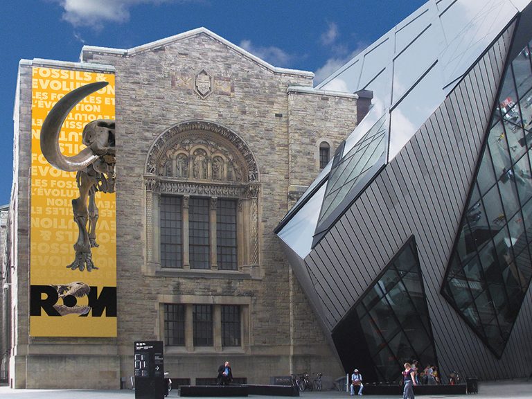
The Royal Ontario Museum is one of the oldest, largest, and most prestigious museums in North America. Every Canadian knows and has affection for the ROM, but research indicated we needed to challenge visitors to view the ROM as a dynamic place worth visiting again and again. The ROM’s 100th anniversary in 2013 offered a timely and singular opportunity to position the ROM as a vital, contemporary museum … ever fresh and relevant. They kept this branding until 2022.
![]()
HISTORICAL EVOLUTION: Heritage (pre 2000) -> Building (2000-2013) -> Community & Content (2014-present)

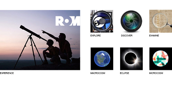
INSPIRATION: The major graphic reference point for the project became the lens: the design echoes the ROM’s role as an illuminating lens through which visitors continue to make new discoveries and gain a deeper scientific, artistic, and historical understanding of the world around them.
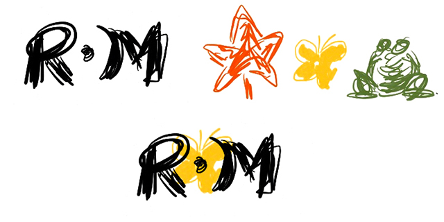
INITIAL CONCEPT SKETCHES: Every project starts with quick sketches. Here are a few of my dozens that became the inspiration for the final identity.
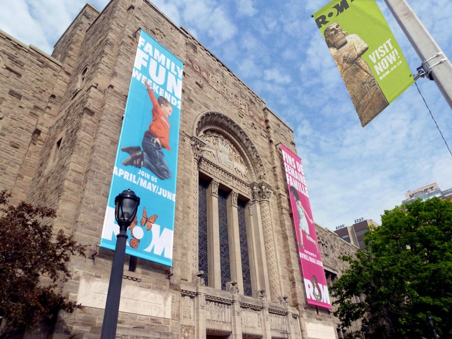
The identity system is able to highlight key objects from across the ROM’s curatorial departments.


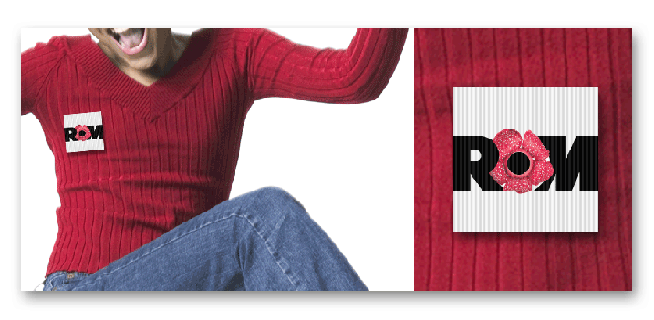
Bold and easily legible, but adaptable to the vast range of audiences that the ROM wanted to target.